

Three Fingers Whiskey
The Three Fingers Whiskey project was a 10-day design sprint in which I assisted five beverage industry professionals in developing and designing a brand identity, brand collateral, and event collateral from conception to high fidelity visuals.

Three views of a liquor bottle filled with brown liquid.
The first image is the bottle front featuring an irregularly-shaped slab of slate with a relief cut of the logo, a stylised roman numeral three (III) with the world fingers on the vertical; the bottom label is copper featuring "wheated rye whiskey" and proof information. The second image features the bottle's side with a black variegated cylinder affixed to the bottle; small portions of the front and back label are visible. The third image features the bottle's back with a copper label with a government warning and a barcode.
In addition to the logo and brand design, I helped the team develop a unique bottle design that would be sure to stand out on any back bar. The bottle features a slate slab fused to the bottle with the logo carved through so that the whiskey is visible through the slate feature. The front is flattened out to allow the rock to be attached. Each slate shape would be unique and naturally formed.

Clockwise from top left: details of the back label (dark grey text on copper); close-up of the bottle cork featuring a dark grey sharpening stone on top; close-up of the farro rod on the bottle’s side; close-up of front’s copper label featuring “Wheated Rye Whiskey”, proof, ABV, and volume information.
The bottle includes some unique outdoorsy features as conceptualised by the team. These additions include a farro rod on the side for starting a campfire, as well as a knife-sharpening stone on the bottle’s cork. These additions were included to strengthen the brand’s place within the US domestic whiskey market among the target demographic of adventurous whiskey consumers.
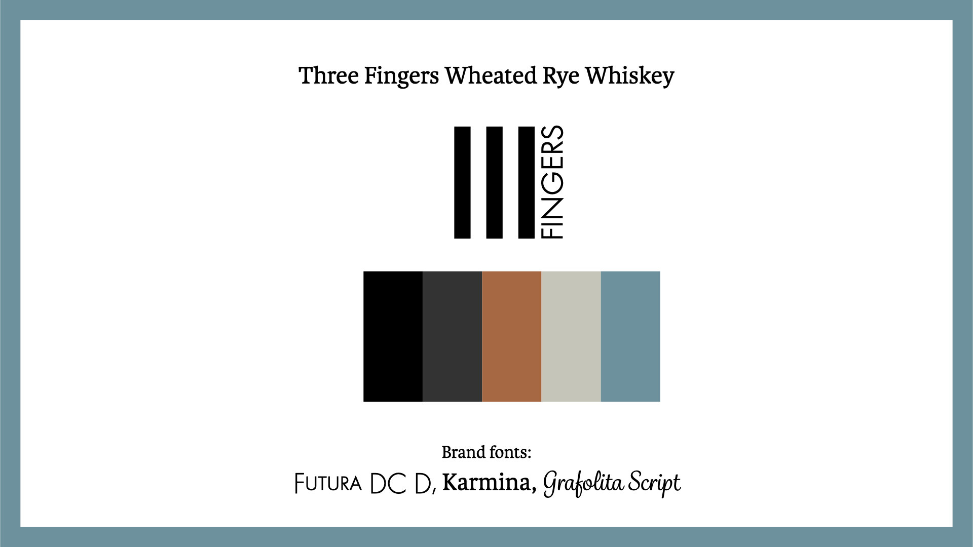


Above: Slide 1 shows the team's final brand identity, executed by me. Slide 2 shows first pass logo options, and Slides 3 and 4 show secondary passes on logos, including the final iteration.


Branded event collateral was also developed as part of the sprint's marketing portion. Anyone who has ever worked in the beverage industry will immediately recognise such ubiquitous swag items among the items I designed for this project—pins, bar keys, ball caps, and bandanas. These items would be distributed at activations to build brand awareness within the industry.
Because these materials are industry-specific, the logo is amended by adding a hand silhouette and the words “read between the lines.” These insider collateral pieces will increase brand recognition within the industry and foster curiosity and interest in the product during the initial roll-out.

Left: a mock-up of an Instagram post on an iPhone X. The post features a group of people having a nighttime picnic and lighting sparklers in the center. Text in the bottom left corner of the image reads “Discover the spirit of adventure” in white serif font; the Three Fingers logo is in white at the top right corner of the image.
Right: vertically stacked examples of other potential social media posts. All feature the same text as the left image and the Three Fingers Whiskey bottle set against other outdoor scenes.
Social media examples using the brand’s tagline “Discover the spirit of adventure” featuring expansive nature photography and images of people enjoying themselves in the outdoors.
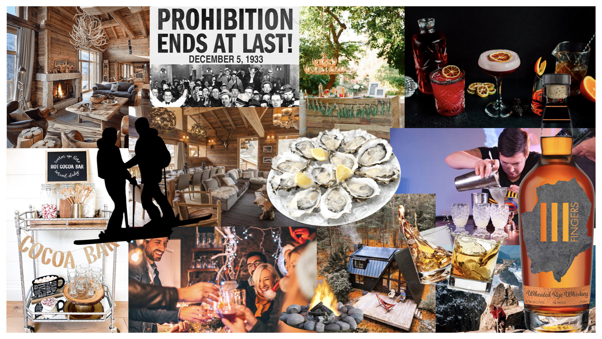
A moodboard featuring images of cocktails, oysters, cabins, people cheersing, and indoor scenes of ski lodges.
The final piece of collateral that I created for the team was a launch event concept board. By taking concepts presented by members of the team, I built a visual representation of their launch event ideas: a wintertime apres-ski themed party held on Repeal Day (Dec 5), featuring a cocktail competition and participation in winter sports.