Accessibility Education and RMIT (II)
Collage of images. One screencap of black text on a white background, a photograph of Post-It notes, screenshots of web interfaces, a second photograph of Post-It notes, white text on a black background reading “using colour to denote action items like links”
This page contains the solution derived from 8 weeks of practice-based research, the research portion of which can be found by clicking here.
The information included on this page is image-heavy, and as a result, a plain text option is available by request.
Developing a Solution
In identifying lecturers as a primary stakeholder, and educating staff about accessibility to be a major action item for the Accessibility Action Plan, phase 3 was dedicated to conceptualising a way to do exactly that.
I did so because I believe that presenting internal education about a complex topic in a streamlined way shows that enacting change in traditionally bureaucratic institutions can be done in an agile way. It was my hope that in presenting a solution that could be tailored to the exact needs of the university, some actionable material could be produced and implemented. It is all well and good to create a 13-page Action Plan with 5-year implementation--but plans and lists without action are little more than well-documented good intentions. If the goal is action and systemic change, more will be required than just the development of long-term Plans.
The medium I chose for this solution was a digital module, similar to those already in use by the University for specialised certifications. I did this for two reasons, the first being that the format is adaptable, and as such would be conducive to iteration and change as needed. The second reason behind my decision was that of practicality. I believe that allowing lectures, as responsible adults with the ability to self-guide their learning, the opportunity to digest information at their own pace and opportunity would be more advantageous, than, say, a required attendance seminar.
Developing the MODULE
I chose to structure this module into four sections, two sections about the nature of accessibility and disability discourse, and two subsequent sections about how accessibility design can be implemented in the scholastic setting. The decision to not focus entirely on either discourse or design was an intentional one, as I hope that in developing this module that I have designed a resource to empower lecturers to not only be able to discuss topics that can feel uncomfortable or taboo like disability, but also to feel as though they’ve learned some actionable principles about access.
On that note, I chose not to focus too heavily on technical design principles in this module, as I am well aware that not every lecturer comes from a design background or feels confident in working in the ‘design’ space. I believe that it is more valuable to provide basic knowledge that could improve course materials across the board, rather than develop a specific set of design specifications that most lecturers would not feel comfortable implementing.
INITIAL ITERATION
I initially conceptualised this as a web-based platform nested under the educator’s section of the RMIT portal.
I realised upon testing that it would be essential to have a structured flow for this module, and as a result, switched to a more linear system design.
Final Iteration: Section One
The first section in the module is a brief overview of what accessibility is, both in terms of physical space as well as in digital application. Presenting accessibility first in terms of the physical helps to create a common language and understanding between the person undertaking the module and the material—everyone is familiar with the concept of wheelchair ramps as an accessibility consideration, but not everyone is familiar with the concept of Audio Description as an access consideration.
By equating familiar and commonplace examples of access with more specialised digital accessibility concepts, I hope to be helping to bridge an understanding gap for those who are new to discussions of accessibility.
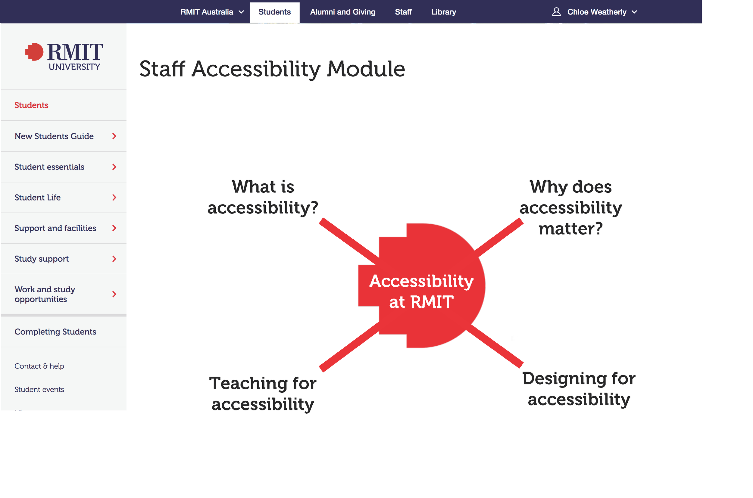
Section one explains the goals of the module, and discusses the nature of accessibility, which for this module is explained in this way:
Accessibility can broadly be defined as designing systems and spaces to be accessible by the greatest number of users.
We most often thing of accessibility in terms of physical space, but accessibility extends to the digital sphere as well.
Just as a building without a ramp or lift is inaccessible to a person in a wheelchair, digital information such as websites, videos, and other course materials can be inaccessible if not designed with access considerations in mind.
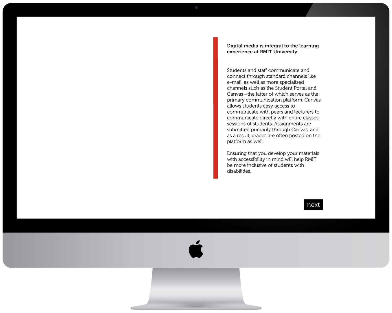
Following this explanation are two slides providing examples of accessibility in familiar terms as well as examples of digital accessibility. The final slide in the section addresses the importance of digital accessibility specific to the RMIT University system.
Final: Section Two
The second section in the module specifically focuses on discussing disability. I adamantly believe that this is an essential component of an introduction to accessibility for multiple reasons. The first, and subjectively the most important, is that using appropriate language when discussing accessibility and disability is necessary, because in discussing people with disabilities, we are in fact, discussing people. Antiquated language like “handicapped’ is considered inappropriate in contemporary discourse at best; at worst it is considered outright offensive and dehumanising.
Choosing to address this from the outset will hopefully mitigate the usage of this sort of language. The other motivation for discussing language, in the beginning, is due to something I have observed the longer I have been working in this space; and that is, that people who do not consider themselves disabled, generally hate discussing disability. Whether this is due to a lack of knowledge of the appropriate language or fear of offending, this aversion to having conversations around disability prevents meaningful discourse about accessibility from happening.
I hope that in making the language around this topic more approachable, that more people within the University environment will be willing to have conversations that they would have otherwise shied away from.
Section two begins with some tips on talking about disability from Arts Access Victoria, which can be read here. Following that, the section lightly touches upon two very important concepts in discussing disability.
The first of which is use of Person-First Language. In the module materials the concept is illustrated in this way:
Person-first language places the state of disability second to the identity of the person with a disability—an example of this can be seen in the previous sentence with the use of the phrase “person with a disability” rather than using “disabled person”.
This reframing of the language of disability makes more space for people with disabilities to be respected and treated as human beings, rather than as their diagnoses.
The second concept touched on is the Social Model of Disability, which is explained in the module as:
The social model of disability states that when systems and processes are not designed for all people, those designs generally put those with different needs at a more significant disadvantage.
Understanding the social model of disability is extremely valuable as it reminds us that many people are effectively rendered disabled not by their physical limitations, but rather by the society in which they live.
It is my belief that having a basic understanding of these concepts will encourage lecturers to be more thoughtful in the construction and design of their course materials.
Final: Section Three
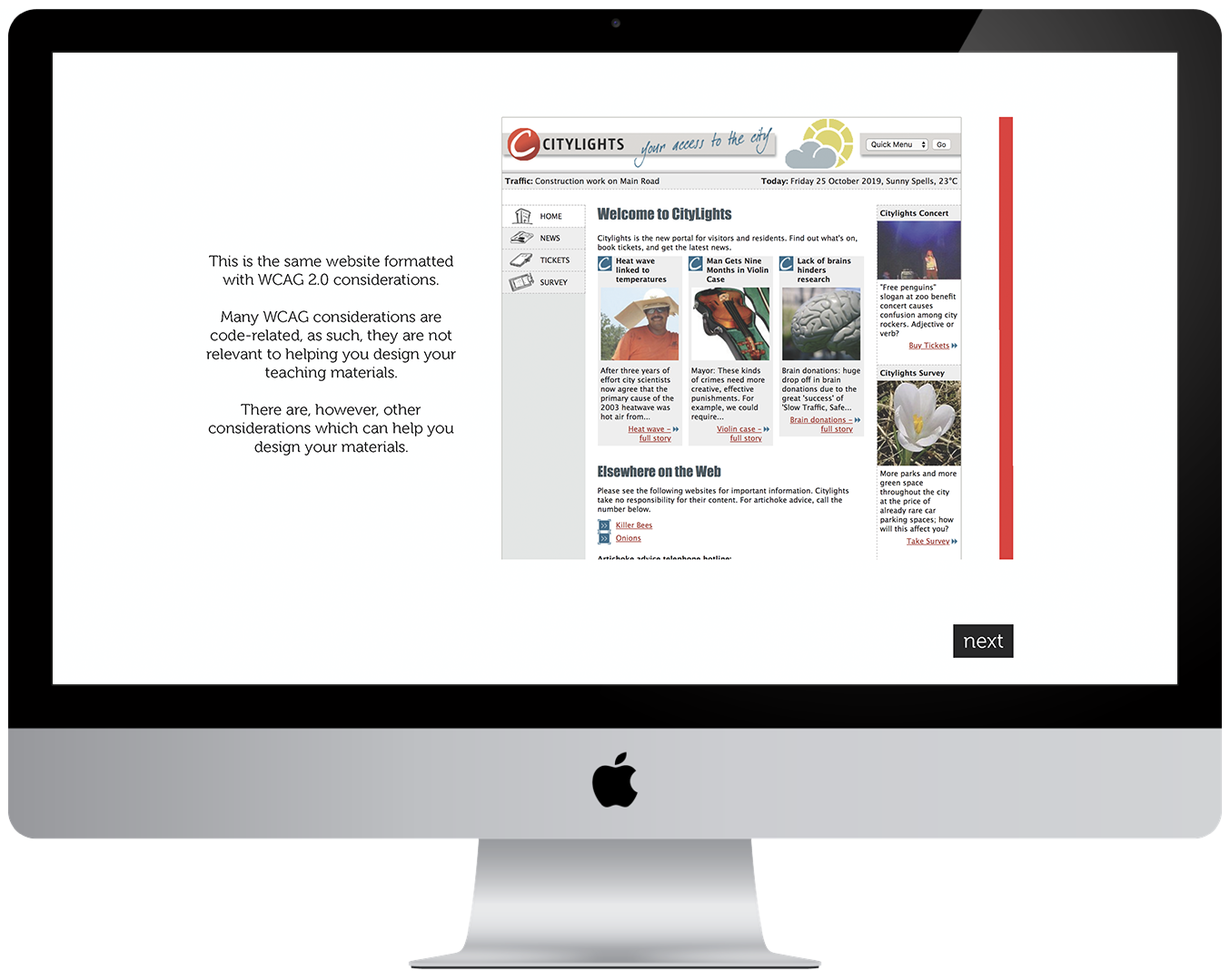
Section three is the first design orientated section in the module and focuses on the implementation of WCAG 2.0 principles in web design. This decision was made as WCAG 2.0 guidelines are the well-established best practices for accessibility within digital design, and many of the principles outlined in WCAG can be translated into other digital documents to optimise compatibility with assistive technology such as screen readers.
Using an example from W3C of a website formatted inaccessibly juxtaposed against the same website formatted to WCAG AA compliance, I did a slide by slide mapping of accessibility considerations, noted individually, in other to aid comprehension. I chose to present this material in such a way as to make it easily comprehensible for non-designers, while actively seeking to not alienate the design community of lectures at RMIT by presenting redundant or worthless information.
It must also be noted that the accessibility considerations discussed in this chapter are primarily valuable due to their interactions with screen reading technology, or are considered by the W3C to be valuable for people with vision impairments. Accessibility compliance factors for utilising screen reading technology that cannot be translated into a non-design context, such as the value of “alt” codes in HTML, have been omitted from this discussion, as they are unlikely to be assistive to the general pool of lecturers.
Final: Section Four
The final section of the module is dedicated to “teaching for accessibility”. In this module, I have taken the basics of accessibility, as outlined in section three and translate them into standard documents, used by teaching staff across disciplines.
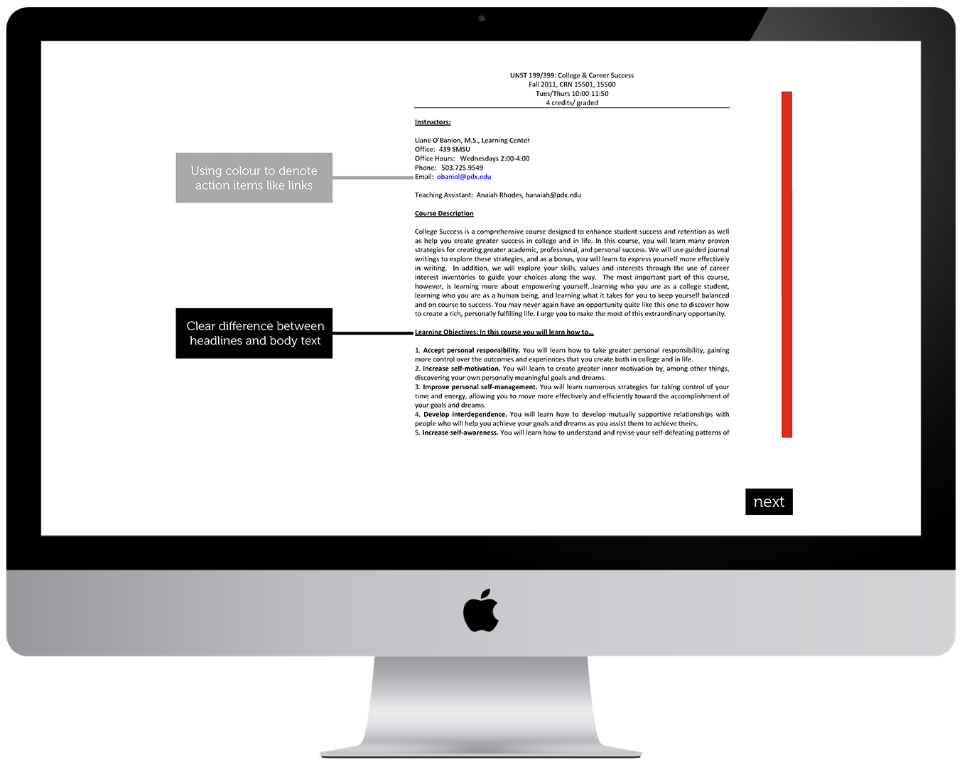
The first example in the section is of a standard syllabus formatted in a way that would be considered inaccessible, including aspects relating to lack of visual hierarchy and colour differentiation. The goal of this example was to translate the information from the previous section into a scenario that would be applicable to most lecturers throughout the university system.
This section also touches on the importance of image descriptions for vision impaired students; lecturers are advised to put their own voice into image descriptions, just as they would other course materials.
The final portion of this section addresses the newly integrated third-party software, UDOIT (pronounced “you do it”) into the RMIT Canvas system. UDOIT performs audits along the metrics outlined in the module, to assess whether or not documents are accessible. Having used this module to educate lectures on the basics of building accessible documents, I wanted to then empower them to perform audits on their documents and seek to improve their course materials with the resulting information.
Reflection on Practice
Accessibility is a topic that is close to my heart. It is very truly the thing that gets me fired up; both when I’m overjoyed to see it done well, and when I see it being poorly implemented if implemented at all. This research project gave me an opportunity to learn a great deal more about the theories behind accessible design, i.e. the Newell and Gregor of it all. I believe that going forward this will allow me to become a much better advocate for accessibility in the next phase of my practice.
If given the opportunity to take this project further, I would like to see it tested and iterated multiple times over. There were decisions I did not feel equipped to make without participant input, such as, should the module contain a required assessment at the end, as other modules do; or would lecturers balk at the concept of being assessed on this information? I legitimately did not know the answer to this question, and others like it, and so there are elements omitted from what could potentially be involved in later iterations of this solution.
Going forward in my practice, I plan to focus heavily on accessibility advocation in the digital space as I possibly can. One of the biggest takeaways from this project will be an increased willingness to work in an agile way and be, as I was advised, to be more “scrappy” with my solution building. I look forward to seeing how I can improve other existing systems where accessibility is concerned, and hopefully be able to do good work that helps more people. In the end, that is what I believe is the most important goal of any designer. To help others.
